


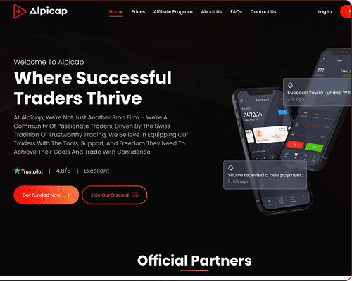


Alpicap is a modern proprietary trading platform designed for traders worldwide. The platform provides funded trading accounts, cutting-edge tools, and real-time support to help traders achieve their financial goals. We crafted a visually appealing, user-friendly, and conversion-focused digital experience.
Alpicap needed a professional and engaging website that could build trust and attract traders in a highly competitive market. The previous design lacked visual appeal, clarity, and a clear flow to guide users through their services, challenges, and offerings. The main challenge was to create a modern interface that would reflect credibility and encourage sign-ups.
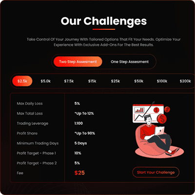
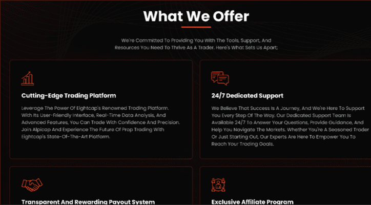
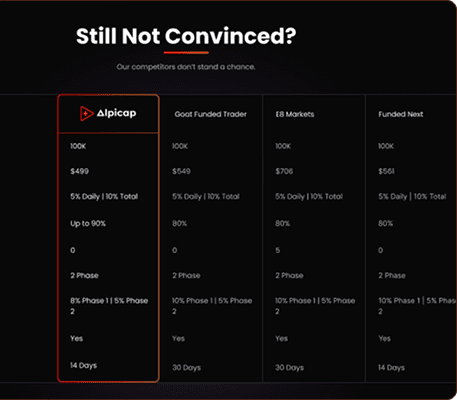
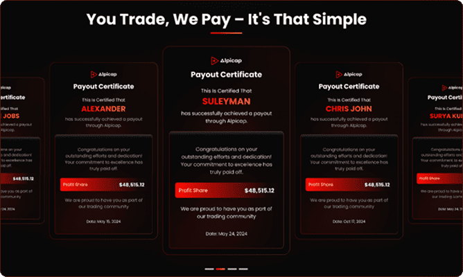
The possible solution was to design a sleek, high-performing website with a strong focus on usability and conversions. We structured the content to explain the platform’s value clearly, highlighted its benefits and partners, and incorporated engaging visuals and CTAs to drive user action. The design also emphasized trust-building elements like payout certificates and partner showcases.
We followed a structured process to ensure a better experience and added value:
Discovery & Research – Studied the prop trading industry, competitors, and target audience to define design goals.
Information Architecture – Organized content for quick understanding and seamless navigation across pages.
Visual Design – Used a modern dark theme with bold highlights to create a premium, trustworthy look.
Focused CTAs – Strategically placed calls-to-action to boost sign-ups and engagement.
Responsive & Scalable – Ensured an optimized experience across devices for traders worldwide.
The new Alpicap website successfully established a strong online presence, improved trust among traders, and increased engagement. The updated structure and visuals made it easier for users to explore services and start challenges. The platform now stands out with a premium, conversion-driven design that aligns with its goals.
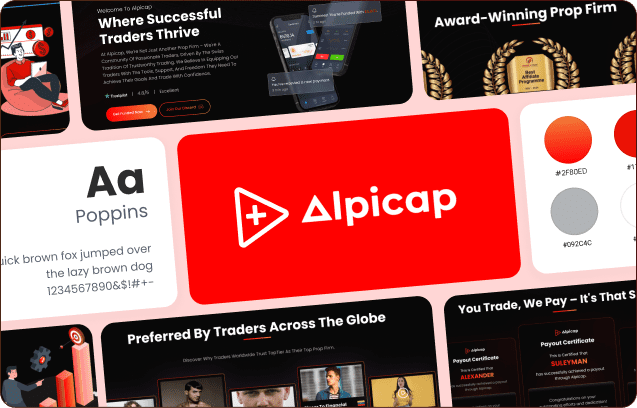
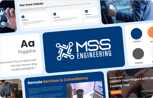
Poppins is a modern and geometric sans serif font known for its clean and balanced design. Its round shapes and consistent structure give it a friendly yet professional look, making it highly readable across screens and print. With a wide range of weights and excellent versatility, it works well for both headings and body text, which is why we chose Poppins for this design.
Primary Color
Secondary Color
Primary Text
Secondary Text
Bg-Alt
A quick overview of the main sections that make up the website, highlighting its structure and important features.
Your vision paired with our expertise. We craft digital experiences that users love and businesses thrive with.