E-Commerce · Marketplace · 2025

E-Commerce Marketplace

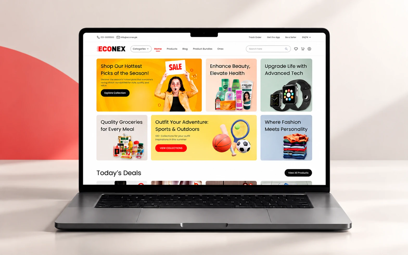
A first version of Econex existed before we stepped in, but it lacked core UX and UI principles. We redesigned it from the ground up into a modern shopping experience built around discovery, comparison, and checkout.

E-commerce marketplace website displayed on a tablet
Econex
Industry
E-CommerceRetail
Services
Product StrategyUX ResearchUI DesignDesign System
Platform
Responsive Web App
Tools and Technologies
Figma
Overview

We rebuilt Econex's early version from the ground up, turning a cluttered, hard-to-navigate storefront into a clear path from
discovery to checkout.

The challenge

Econex's first version was live, but it lacked the core UX and UI foundations a shopping platform needs. Categories were hard to distinguish, there was no way to compare products side by side, and checkout dragged on across too many steps. Users struggled to find and compare products, while the mobile experience made browsing and purchasing even more difficult.

Result

A redesigned platform with clear navigation, a built-in comparison tool, and a streamlined checkout, rebuilt with the UX and UI principles the original version never had.

Clear navigationBuilt-in product comparisonStreamlined checkout
Website

A first version of Econex existed before we stepped in, but it lacked core UX and UI principles. We redesigned it from the ground up into a modern shopping experience built around discovery, comparison, and checkout.

Before → after

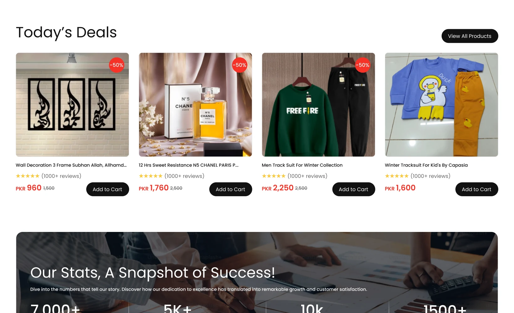
Before, cluttered categories, hidden navigation, no comparison feature, and a long multi-step checkout pushed people to abandon their carts. After, a restructured information architecture, dedicated comparison page, and linear checkout created a clearer path to purchase.
Information architecture

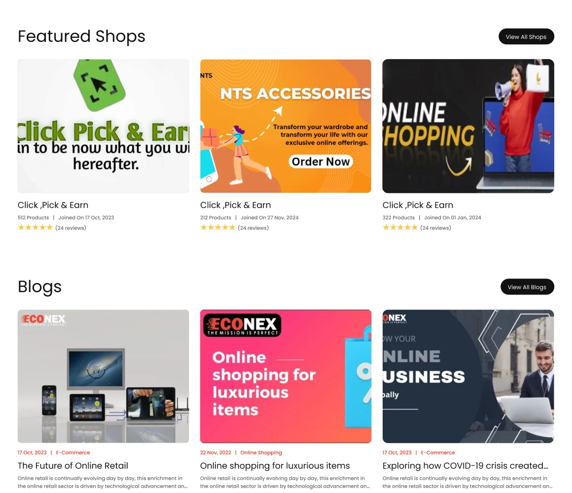
The marketplace was organized around intuitive discovery and a focused path to purchase, with comparison built into the journey instead of forcing users to open multiple tabs.

HomeCategoriesProductsBlogProduct BundlesCartAccount

Design system

A clean, modern system supports product-heavy pages through reusable cards, comparison tables, checkout steps, category tiles, and a green confirmation state.

Primary

Black

#121212

Accent

Red

#F63227

Secondary

Grey

#656565

Background

Light Grey

#E8E8E8

Primary type / Poppins

Aa

Discover. Compare. Checkout.

400 / Regular500 / Medium700 / Bold
One family / Complete system

Regular: body and supporting copy

Medium: controls and emphasis

Bold: headlines and moments

Key screens

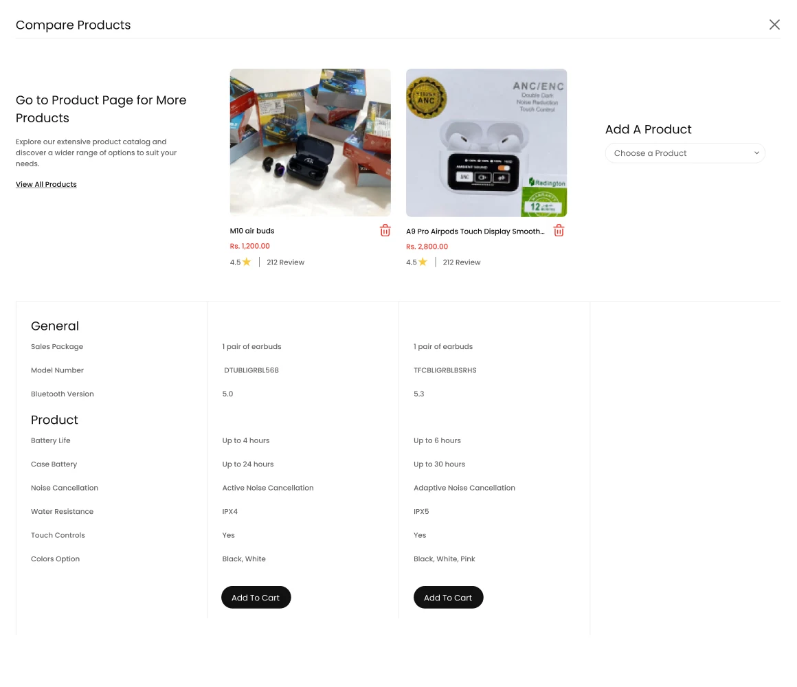
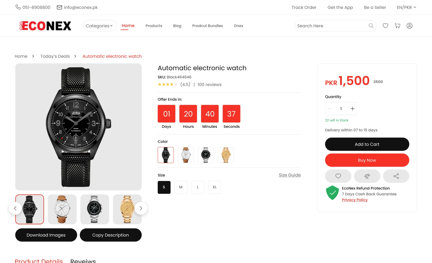
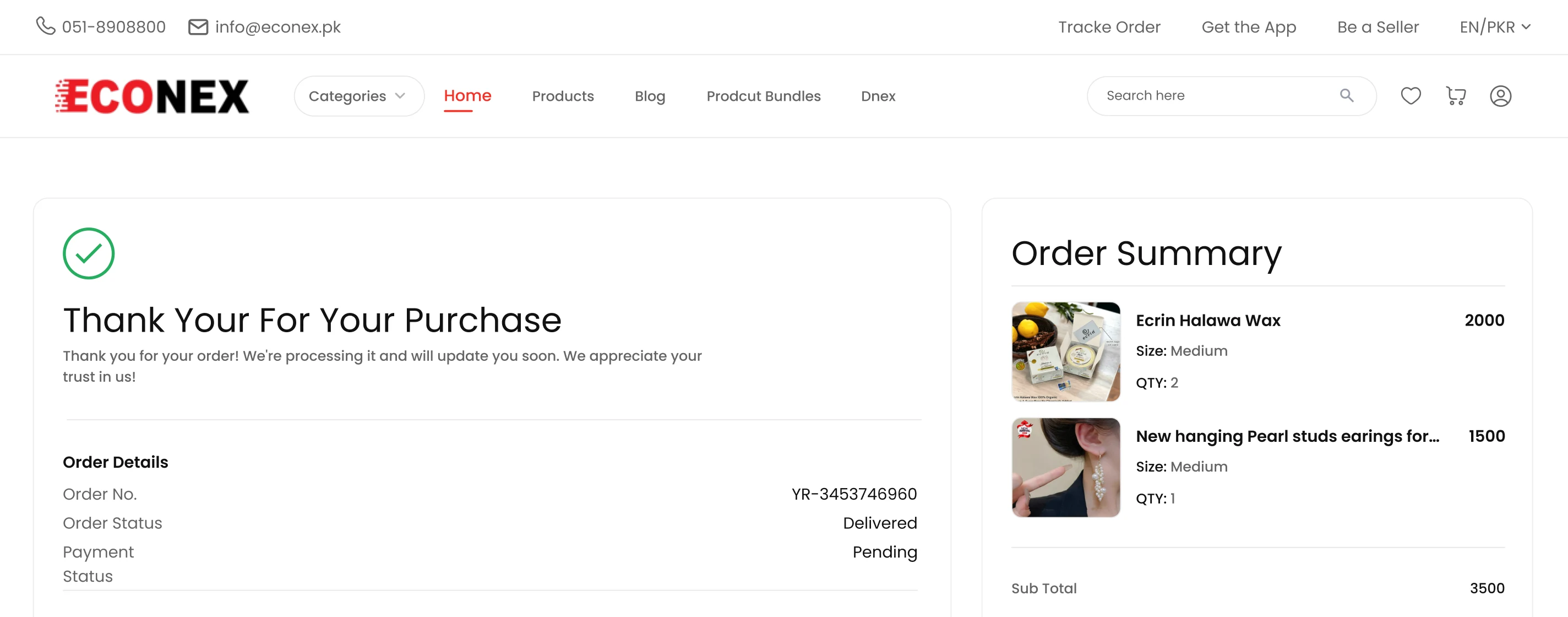
The responsive experience covers the landing page, product listing and filters, product details, side-by-side comparison, cart totals, and a shorter linear checkout flow.

Econex e-commerce marketplace landing page with featured products and categories
Econex product listing with filters and sorting
Econex product detail page with pricing, imagery, and specifications
Econex side-by-side product comparison page
Econex responsive cart and checkout experience
Approach

  • Reviewed the original experience and used the key research signals to identify friction across discovery, comparison, mobile browsing, and checkout.

Outcome

Clearer shopping journey

Simplified the path from product discovery to checkout with clearer navigation and flows.

01

Easier product discovery

Improved product organization and browsing to help users find what they need faster.

02

Smoother checkout

Reduced friction across cart and checkout with a more focused, straightforward experience.

03
Let's Talk

Tell us what you're trying to achieve, what's getting in the way, or where you're not sure what to do next. We'll bring a different perspective.

Let's build what matters.

Start a conversation